Cafe White Eye
An artisan café brand rooted in warmth, craft, and character.

An artisan café brand rooted in warmth, craft, and character.
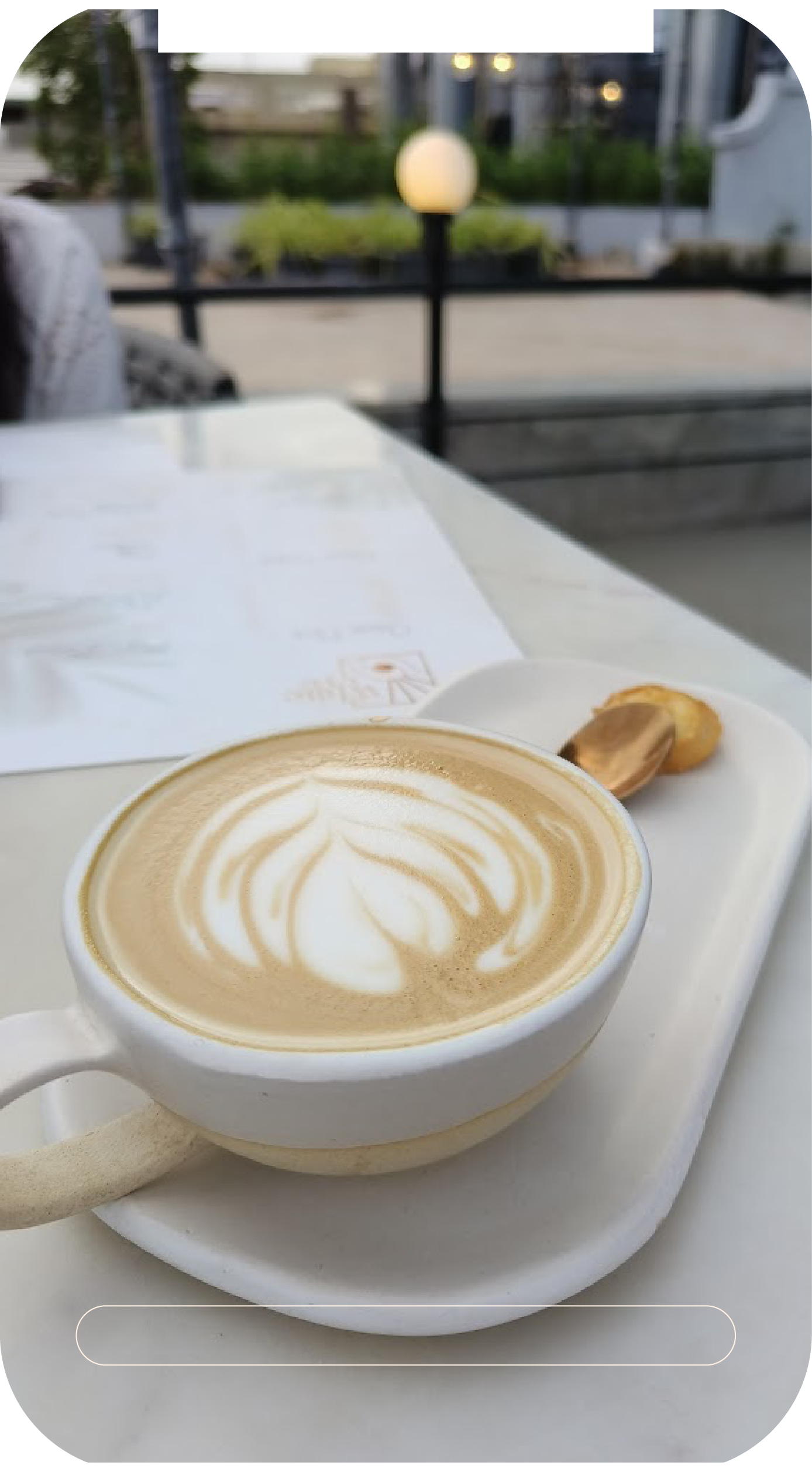
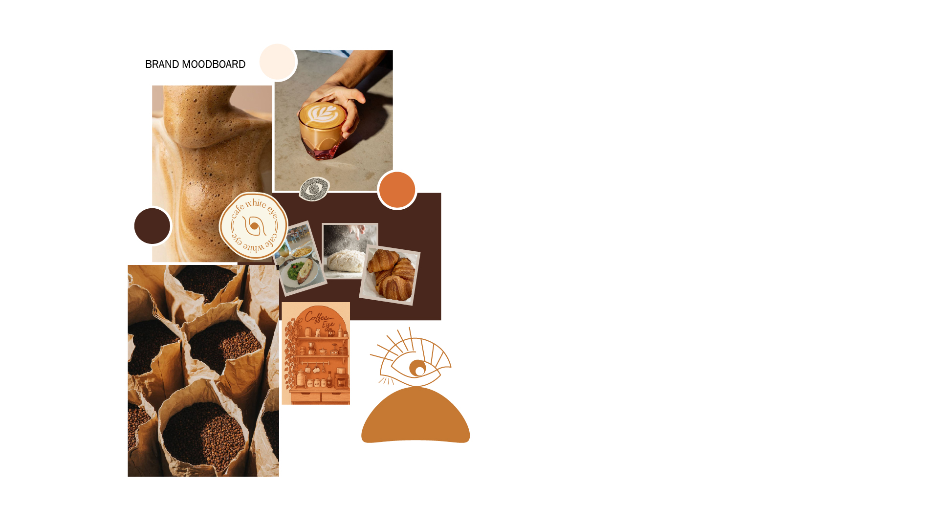
Cafe White Eye is a brand identity project for an artisan café that celebrates the ritual of coffee — the warmth of a cup in hand, the richness of freshly roasted beans, and the quiet joy of a perfectly crafted space. The brand needed to feel handcrafted, warm, and inviting — like the café itself.
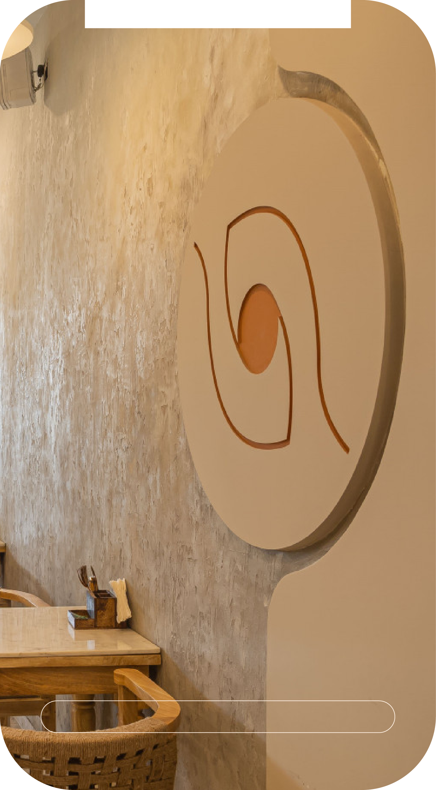
The result is a cohesive visual system built around an eye motif — symbolizing observation, presence, and the art of noticing the details. From logo variations to color palette and typography, every element conveys craft and character.
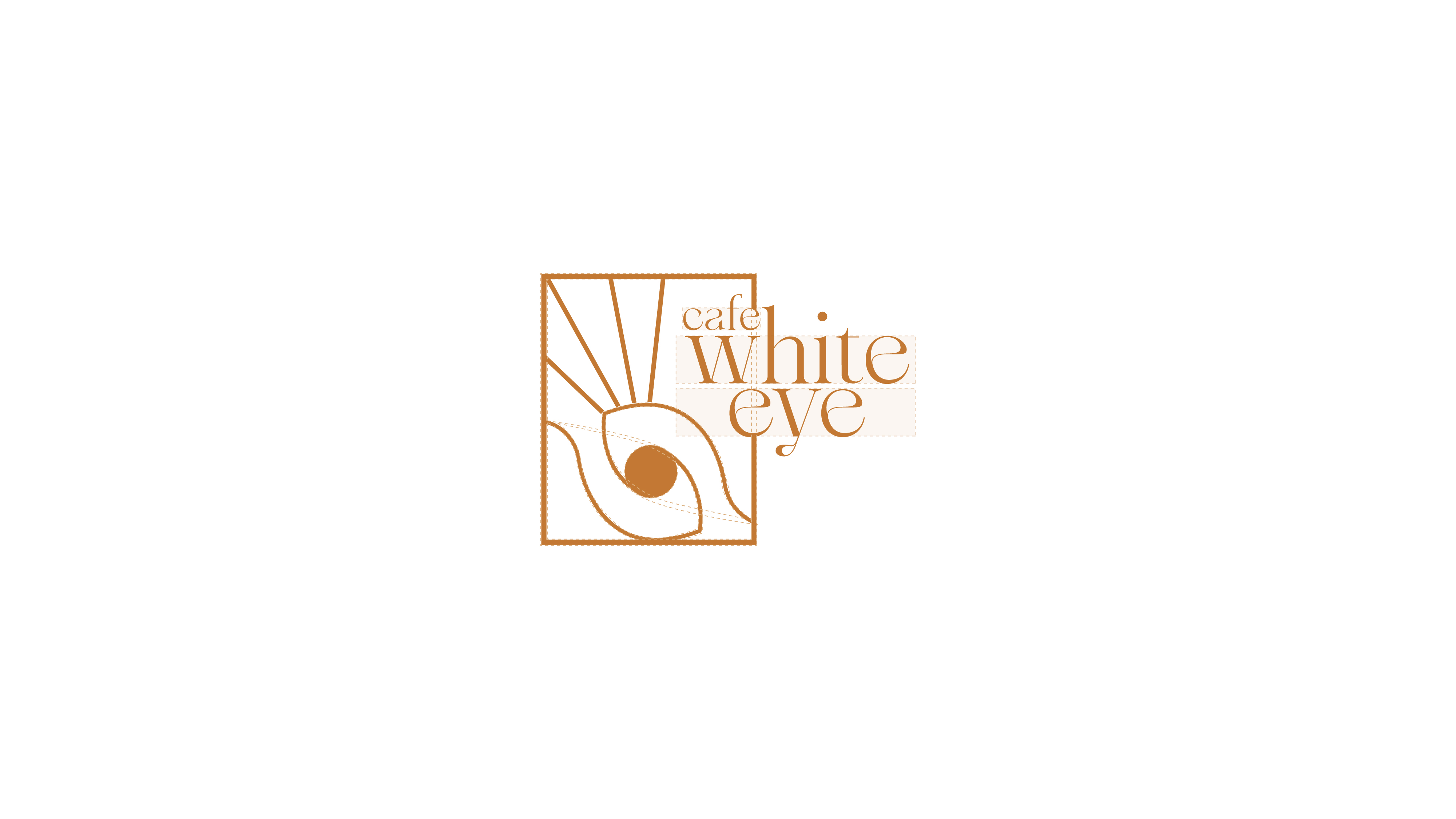
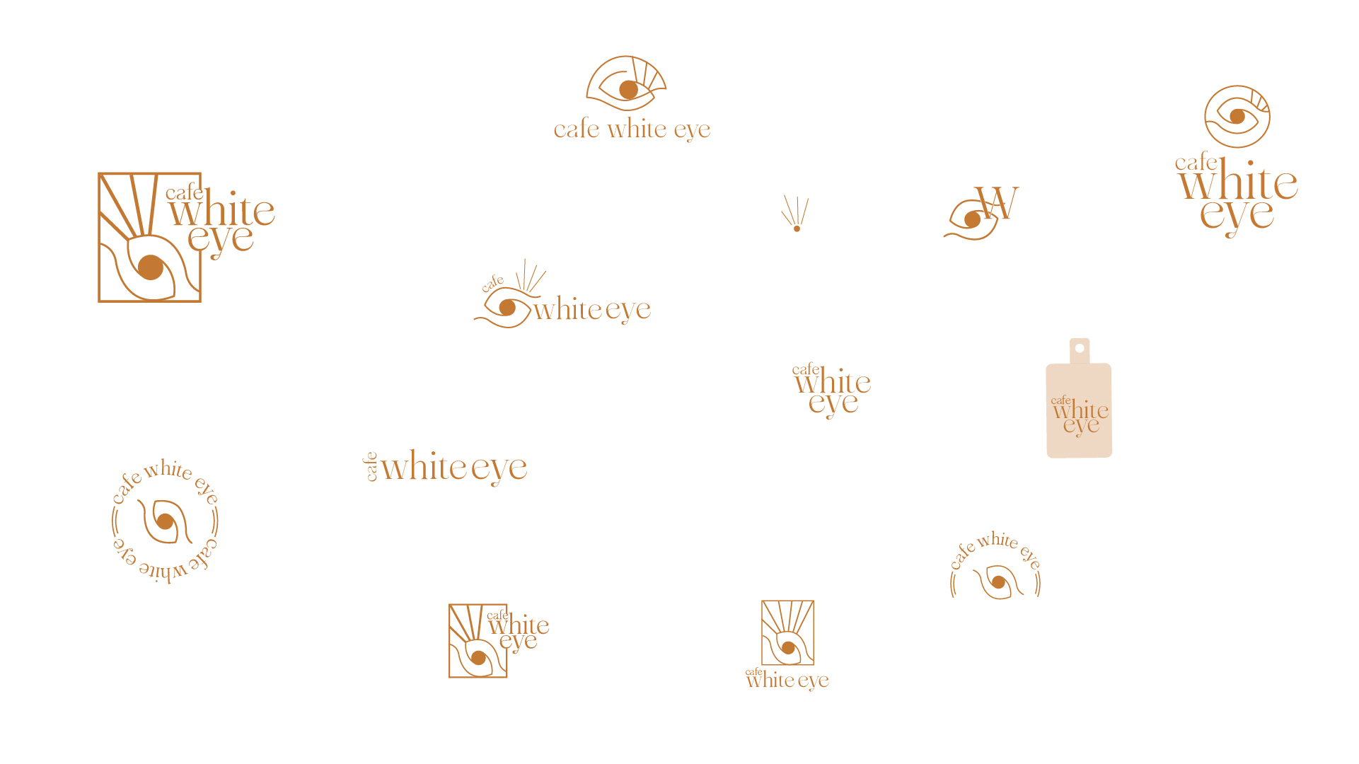
The logo concept for White Eye Café is inspired by the idea that coffee awakens the senses. The design combines the top view of a coffee cup with the form of an eye, creating a visual metaphor for alertness, awareness, and the energizing experience of coffee.
The circular shape represents the surface of a freshly brewed cup while subtly forming the iris of an eye, symbolizing clarity, focus, and the moment of awakening that coffee brings. The minimal design ensures the logo remains memorable, versatile, and adaptable across café signage, packaging, and digital platforms.
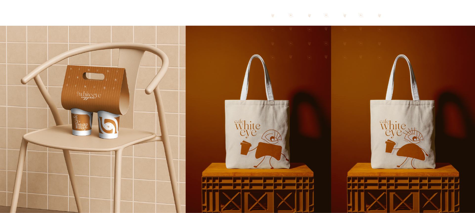
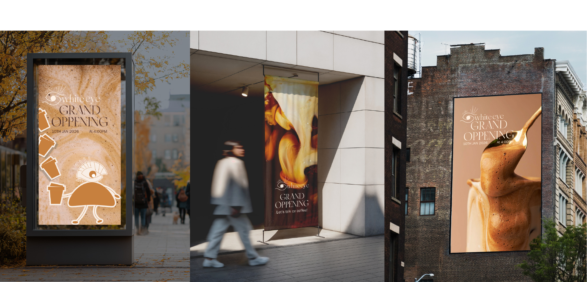
Built a cohesive cafe identity system with a distinctive visual language designed to feel warm, memorable, and adaptable across every brand touchpoint.
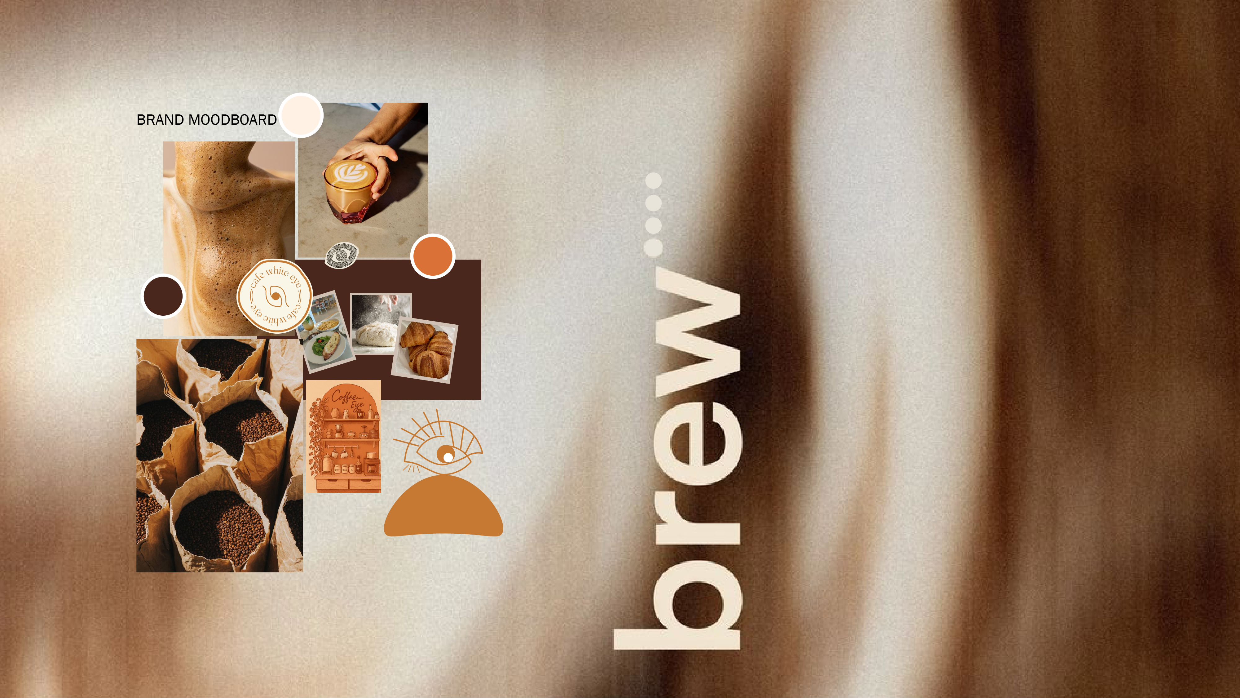
Defined a clear creative direction centered on craft, coffee culture, and sensory storytelling to shape how the brand connects with its audience.
Extended the identity across practical branded applications including stickers, packaging, and promotional assets for a complete cafe experience.